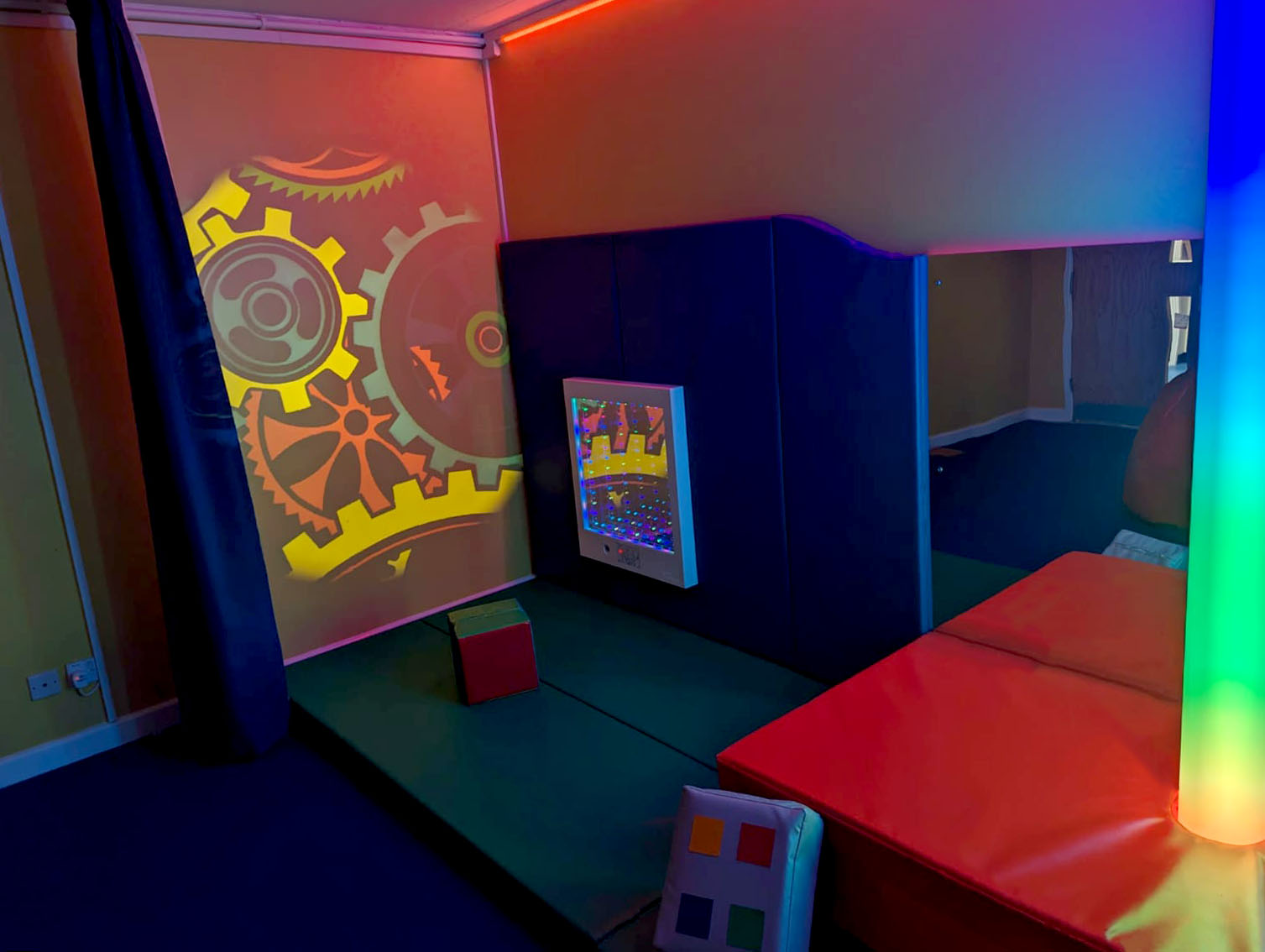
Did you know that colours cause a biochemical reaction in the brain? Scientific and psychological research has proven that colour can have a direct effect on our mood, behaviour, productivity and communication.
With this in mind, when it comes to creating a sensory room, the choice of colour can have great effects, benefits and disadvantages to it’s users. Although it may not be possible to consider every individual need when designing a shared space, in this weeks blog post we have compiled some key points for you to consider.
How are colours processed?
It’s important to tackle this from the perspective of a neurodivergent individual, as they can have chemical deficiencies in their brain, and hyper-sensation characteristics (such as ADD, ADHD) can lead them to process colour differently. The correct use of colour in their learning environment could therefore lead to more positive experiences and desired reactions.
Studies show that children with attention deficiency hyperactivity have a functional and anatomical deficiency in their retinas – causing them to experience difficulties with certain colours. This would be similar for those on the autistic spectrum, with 85% of children on the spectrum perceiving colours more intensely. Synaesthesia is common in autism – a condition in which you can see sounds, hear colours and taste shapes, which can be a distressing and overwhelming aspect of everyday life.
What are the effects of different colours?
Based on current research, it would be advised to avoid colours such as:
Red = high energy, can trigger tension and anger, associated with pain, can cause increase in heart rate, blood pressure, appetite.
Yellow = Sensory overload, overstimulating, intensity.
White = Increased anxiety levels due to lack of comfort, negative association with hospitals and medical trauma.
Instead, children on the autistic spectrum or with an active behavioural and impulse problem, would benefit from calming colours, to help prevent energy burnout and improve concentration.
Pastel tones = Comforting, calming, supportive.
Neutral tones = Similar to above. Creates a sense of wellbeing.
Blue = Encourages calm, regulates the nervous system, creates a quiet and relaxing space.
Green = Creates an ideal learning environment, aids concentration and focus, reduces overstimulation.
Pink = Safe, loving, nurturing.
More introverted children who have learning disabilities would benefit from engaging colours such as yellow, orange and purple that work to enhance energy levels, attention and socialisation. These colours would be beneficial in a play or activity setting to encourage participation:
Orange = Stimulates brain, triggers socialisation
Yellow = Social confidence, high energy.
Research has been conducted into how the environment where a patient receives treatment directly influences their response to the treatment and recovery process. For example, excessive use of white can have a negative, depressive impact leading to anxiety due to association with past discomfort and distress in a medical environment. Instead, the use of muted tones such as cream or sand and calming pastel shades such as lilac allows the patient to feel calm and at ease and for staff to achieve optimum results.
How do I know which sensory room colours to choose?
There are times where you can combine colours, if you wish for your sensory environment to serve for various purposes.
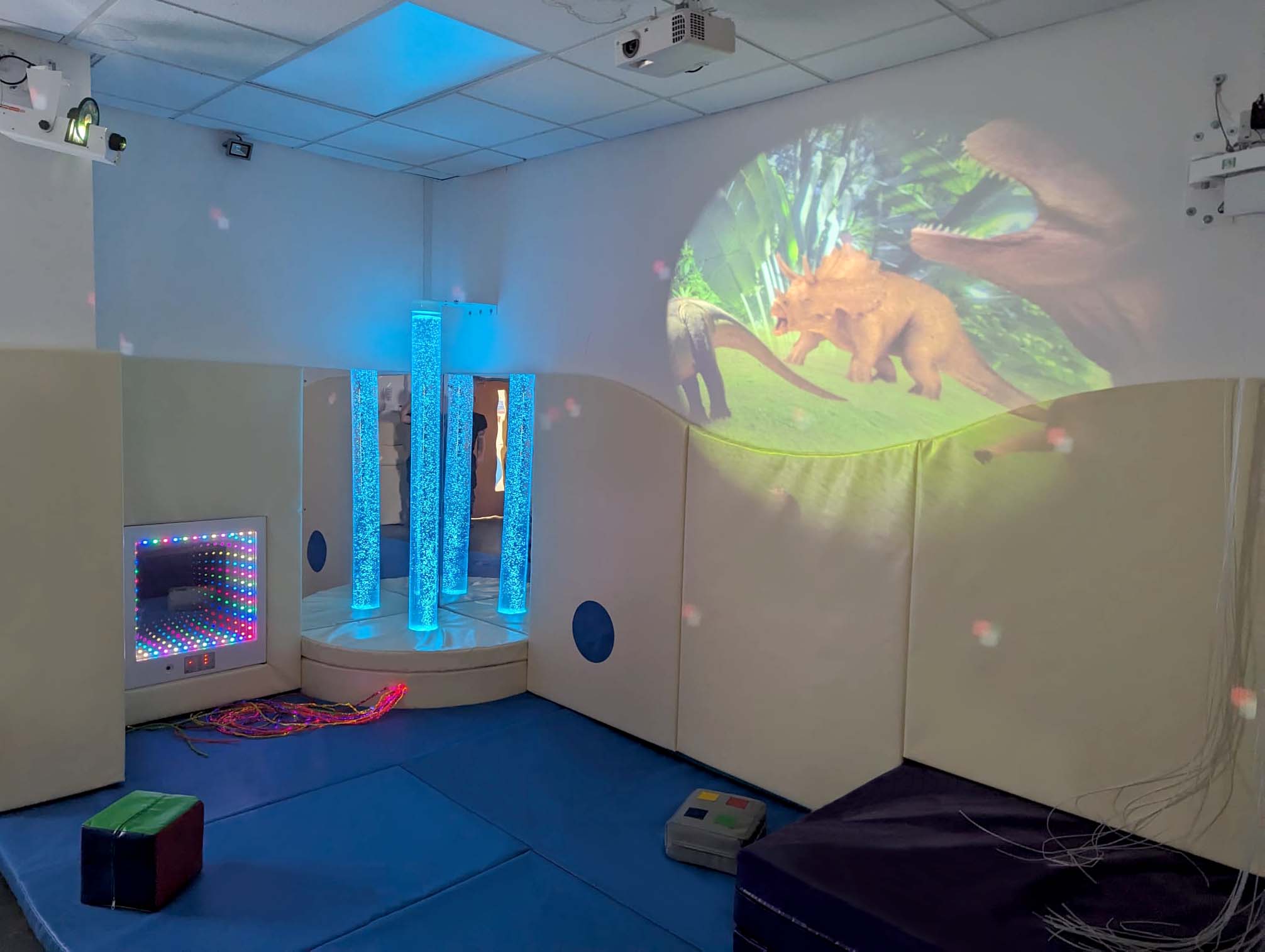
For example, our sensory soft-play installation at a Primary School in London included a dark and light blue as base colours amongst the floor and wall padding to induce a calm and relaxing atmosphere.
Within the various soft-play equipment included in the room, pastel tones such as lilac and pink were also used alongside the blue to enhance the feeling of safety and support. However, to encourage stimulation and socialisation – hints of yellow and orange were incorporated.
On the contrary, selecting just one key colour is also an option, especially for environments such as calming rooms where the aim is to provide a safe space for users who are in an emotionally raised state to de-escalate. For example, our calming room installation at a Primary School in Liverpool was solely made up of a light / pastel blue tone, which supported the key purpose of the room being a quiet and relaxing place.
The Sensory Technology Colour Range
We have recently added a range of new colours to our catalogue – including an extensive range of pastel and neutral tones. As leaders in UK sensory innovation, we aim to continue making industry-first developments in order to maintain first class service to our customers.
If you’re unsure about which colours to include in your sensory environment, our team of experts are available to help!


